Baking Accessibility into Your Design System
There is a lot of talk about accessibility and compliance — whether it’s WCAG, the European Accessibility Act (EAA), or country-specific regulations like Section 508, the Americans with Disabilities Act, or the UK Equality Act.
This can create confusion about what is or isn’t compliant and how to support the widest set of users while meeting those requirements. The goal is to make products and services accessible to the broadest possible audience.
Accessibility isn’t only a legal or moral consideration — it’s also a smart business decision. The more people who can use your product, the more users and potential revenue you create.
There can be a lot of remedial work involved in retrofitting accessibility compliance, which is why it’s far better to build it in from the start. Whether you’re creating a new design system or improving an existing one, accessibility must be baked into the foundation — every component, every colour, every token. As the saying goes, the best time to plant a tree was twenty years ago, but the next best time is now — the same applies to accessibility. Even if your system wasn’t built with it from the beginning, the right time to start is today.
The Right Starting Point
Begin by setting clear accessibility compliance standards that guide everything that follows.
Start with WCAG 2.2 AA as your baseline — it’s the practical, achievable level for most products and services. Understand that AAA conformance is intended for specific accessibility needs and not a general requirement for all content.
Next, check regional or legal frameworks, such as the European Accessibility Act (EAA) or local laws like Section 508, the ADA, or the UK Equality Act, to ensure your system aligns with the right standards in every market.
Then move on to the principles of accessibility — Perceivable, Operable, Understandable, and Robust (POUR) — as the foundation of every design and component decision.
From there, establish:
- Colour contrast ratios following both WCAG and APCA standards to ensure perceptual accuracy.
- Text and spacing rules for readability across devices.
- Defined interaction and state behaviours to maintain consistency and clarity.
- Keyboard navigation at both the page and component level for complete operability.
- Screen reader support, with correctly implemented semantic order, ARIA roles, and labels.
- Clear content rules for microcopy, alt text, and descriptions.
- Alignment with development teams to ensure accessibility standards are reflected in code and maintained through reviews and testing.
These are the guardrails that keep your system inclusive from the ground up.
Bake It Into the System
Accessibility works best when it’s baked in — not sprinkled on.
- Build accessibility into every variant, not just the defaults.
- Document inclusive patterns clearly and practically.
- Test in context, including screen reader flows, dark and high-contrast modes, and touch or mobility interactions.
The goal is to make accessibility a natural part of the design and development process — an expectation, not an afterthought.
Why It Works
When accessibility is built into the system:
- Designers make fewer mistakes.
- Developers build with greater confidence.
- Users benefit — all users.
It’s faster, fairer, and far more future-proof.
Key Take Away
Building accessibility into your design system from the start creates better experiences for users, smoother delivery for teams, and stronger foundations for growth.TL;DR
Featured work
ion Design System
Global design system for RS Group
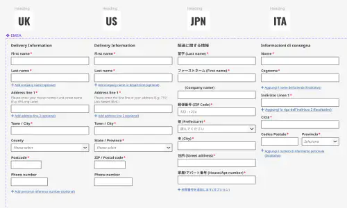
- Design System
- E-commerce
- B2B
Created a scalable, accessible design system adopted across RS Group’s global digital teams, aligning Figma and Tailwind through design tokens.
Client Onboarding
KYC onboarding for wealth management — faster, clearer, fewer errors
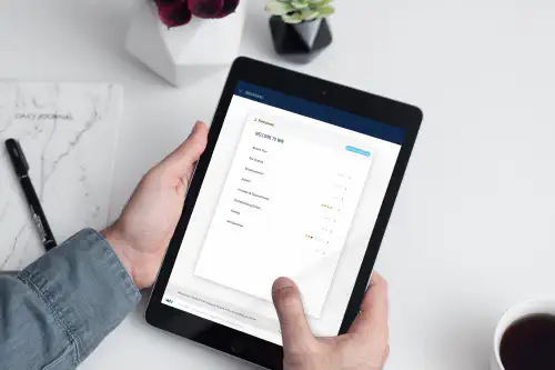
- SaaS
- Fintech
- Onboarding
- KYC
Co-created a configurable, advisor-led onboarding flow that reduced friction for investors and managers, and achieved 100% pre‑launch adoption with pilot customers.