Common Accessibility Mistakes Product Teams Still Make
Accessibility is often misunderstood. Many teams think they’re doing the right thing—pushing for AAA compliance, turning everything high-contrast, or focusing only on screen readers. But accessibility isn’t a checklist, and compliance isn’t the same as usability.
In this guide, we’ll explore seven common accessibility mistakes product and SaaS teams make, why they happen, and how to fix them without adding unnecessary complexity.
Contents
Thinking WCAG AAA means “best”
Many teams chase WCAG AAA thinking it’s the gold standard, but AAA isn’t always realistic—or required.
The Web Content Accessibility Guidelines (WCAG) define three levels: A (basic), AA (recommended), and AAA (advanced). Most legal and procurement frameworks, including the European Accessibility Act and Section 508 (US), cite AA as the expected baseline.
AAA criteria can be valuable for specific contexts (like public services or education) but often demand trade-offs: limited colour palettes, more complex markup, or content constraints that don’t scale well in SaaS.
Better approach:
Aim for consistent AA compliance with selected AAA enhancements that genuinely improve experience—like higher contrast for dashboards or live captioning in video calls. Always prioritise usability over badges.
Decision Table: Understanding WCAG Levels
| Level | Description | When to Use |
|---|---|---|
| AA (Minimum) | The standard baseline for accessibility that meets most users’ needs and legal expectations. | Always target this level for all products. |
| AA + Selective AAA (Accessibility Boosts) | Builds on AA with a few targeted AAA features—such as higher contrast or live captions—to improve usability further. | Ideal for customer-facing SaaS or high-traffic products. |
| AAA (Where Feasible) | The most advanced level, covering all WCAG success criteria. Often resource-intensive but delivers maximum inclusion. | Suitable for public sector, education, or regulated industries where full access is essential. |
| AAA (Targeted) | Apply AAA selectively to critical features or high-risk contexts. | For medical, financial, or civic services where users rely on precise accessibility support. |
Designing for screen readers only
Accessibility extends far beyond blind or low-vision users. Focusing only on screen readers overlooks mobility, hearing, speech, and cognitive differences.
For instance, a user with repetitive strain injury may rely on keyboard navigation, not a screen reader. A customer in a noisy café might need captions, not ARIA labels. A dyslexic user might benefit from consistent layouts and clear language, not alt text.
Better approach:
Think in modalities, not disabilities. Test with:
- Keyboard-only navigation (Tab and Shift+Tab)
- Screen reader basics (NVDA or VoiceOver)
- Zoom up to 200%
- Colour contrast simulators
- Real users when possible
Accessibility is multi-sensory—it’s about flexibility, not any single assistive tool.
Equating “high contrast” with accessible design
One of the most persistent myths is that “high contrast” automatically equals “accessible.”
Overly intense contrast can create glare, strain, or distractive interfaces, particularly in data-heavy SaaS dashboards.
WCAG contrast ratios (4.5:1 for normal text, 3:1 for large text) are guidelines for legibility, not aesthetic targets. Accessibility is also about focus indicators, spacing, and clarity, not just colour.
Better approach:
- Test contrast using tools like Contrast Checker (WebAIM Contrast Checker), SilkTide Toolbar (silktide.com/toolbar), or Stark (stark.co).
- Use colour purposefully—contrast enough for text, but avoid full black-on-white for large surfaces. Pure white (#FFFFFF) on pure black (#000000) creates a contrast ratio of 21:1—the maximum possible—but such extreme contrast can cause visual fatigue and eye strain for everyone, not just those with sensitivity issues. Opt for slightly softened tones (e.g., dark grey on off-white) to maintain legibility without harshness.
- Provide a theme switcher where feasible (light/dark or calm/high contrast).
Forgetting keyboard and focus order
Even highly visual apps can exclude users if keyboard focus is broken.
Many teams rely on mouse interactions or custom components that ignore native focus behaviour.
When focus jumps erratically—or disappears entirely—keyboard users lose context. Screen readers also announce items in the wrong order, creating confusion.
Keyboard navigation and focus management are not just developer concerns. Designers play a vital role too. When designing an experience, consider not only mouse and touch interactions but also how a user will navigate by keyboard or other input devices. The visual and interaction design should make the focus order intuitive and predictable from the start.
Better approach:
- Ensure all interactive elements are focusable (
tabindex=0or native elements). - Use logical DOM order that matches visual order.
- Add visible focus states—don’t remove the outline.
- Test real-world flows: tab through a form, modal, or dropdown.
Accessibility isn’t just about reading content—it’s about navigating and completing tasks.
Assuming automated tests are enough
Automated tools like axe, Lighthouse, or Wave catch 30–40% of issues. The rest require human judgement—especially around language clarity, labels, and cognitive load.
Teams often tick off automated scores but miss the experience gaps that real users face: unclear instructions, inconsistent headings, or poor error recovery.
Better approach:
Adopt a layered testing model:
- Automated checks in CI/CD (Continuous Integration and Continuous Deployment) pipelines for regressions, ensuring accessibility tests run automatically with every build.
- Manual expert audits every release cycle.
- User feedback and assistive tech testing quarterly.
Accessibility testing is continuous quality assurance, not a post-launch audit.
Ignoring cognitive and situational barriers
Accessibility isn’t just about permanent impairments. It’s also about temporary and situational barriers—like fatigue, stress, or working on a train.
Cognitive accessibility affects how people process information: dense text, unclear hierarchy, or jargon-heavy UX can create friction even for skilled users.
Better approach:
- Use plain language and short paragraphs.
- Structure content with clear headings.
- Provide visual anchors (icons, progress bars, summaries).
- Avoid time-limited interactions unless essential.
Inclusive design benefits everyone. What helps someone with ADHD often helps a busy parent too.
Treating accessibility as a one-off project
Accessibility isn’t a sprint goal; it’s a product discipline.
Teams often rush to “get compliant” after a legal scare or client requirement, then stop investing.
Without ownership and feedback loops, regressions creep in fast—especially when design systems or components evolve.
Think of accessibility as tending a garden or vegetable patch. It requires regular care, attention, and collective responsibility. If neglected, weeds—small issues—quickly overgrow and choke the healthy parts of the product. Continuous maintenance, pruning, and nurturing from every team member keep the experience inclusive and thriving.
Accessibility is a shared responsibility, not just for developers or compliance officers. Everyone—from designers to product owners, QA testers, and writers—plays a part in maintaining and improving it.
Better approach:
- Embed accessibility in definition of done.
- Assign an accessibility champion per team.
- Audit components quarterly.
- Share quick wins and learnings across squads.
Accessibility maturity grows through culture, not compliance alone.
Mini Case Study: Making Accessibility the Easy Choice
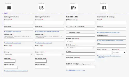
In a FTSE100 e-commerce design system project I led, accessibility wasn’t an afterthought — it was part of everything from day one. Our design system covered more than 70 components across a shared Figma library and a React + Tailwind codebase. We made accessibility a built-in benefit, not a chore, showing teams how it made their products cleaner, faster, and easier to use.
We rolled things out gradually over about 12 months, testing each component as part of our QA and readiness process. During usability testing, we measured System Usability Scale (SUS) scores on sample user journeys, which consistently landed between 85 and 96.7. After release, teams kept saying how much better everything looked and felt — more modern, more cohesive, and simply more usable.
Adoption spread quickly, first across EMEA, then into APAC, the Americas, and subsidiaries. The work gave us a solid footing for meeting EAA compliance down the line, but more importantly, it showed that accessibility and good design go hand in hand. Once teams saw the difference in a few components, everyone wanted to play their part.
Action Checklist
✅ Prioritise WCAG AA as the realistic baseline
✅ Test beyond screen readers—include keyboard and zoom scenarios
✅ Check colour contrast ratios, not just “high contrast” themes
✅ Keep focus order and visible outlines intact
✅ Combine automated and manual testing
✅ Consider cognitive and situational accessibility
✅ Make accessibility part of continuous delivery
✅ Nominate accessibility champions
✅ Measure outcomes, not just compliance
Conclusion: From Myths to Momentum
Accessibility isn’t about ticking boxes—it’s about making products usable for everyone.
When teams move beyond misconceptions, accessibility stops being a compliance chore and becomes a strategic advantage: lower churn, higher engagement, and stronger brand reputation.
Start small, build habits, and educate your teams. The most accessible products aren’t perfect—they’re aware and iterative.
Featured work
ion Design System
Global design system for RS Group
- Design System
- E-commerce
- B2B
Created a scalable, accessible design system adopted across RS Group’s global digital teams, aligning Figma and Tailwind through design tokens.
Client Onboarding
KYC onboarding for wealth management — faster, clearer, fewer errors
- SaaS
- Fintech
- Onboarding
- KYC
Co-created a configurable, advisor-led onboarding flow that reduced friction for investors and managers, and achieved 100% pre‑launch adoption with pilot customers.