Setting an Accessibility Starting Point
Accessibility is a big goal, but it can be reached through small, continuous steps. Progress comes from moving consistently in the right direction — making every iteration slightly more inclusive than the last.
That “right direction” part matters. To move effectively, you need clear principles and shared values to guide your work. The steps below offer a practical starting point. Adapt them to your organisation, your product, and — most importantly — your users.
Keyboard accessibility

Inclusive language and content accessibility
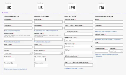
Inclusive communication is part of accessibility. Ensure terminology is neutral, respectful, and understandable for all audiences, including neurodiverse users. Avoid idioms or culturally specific references, and use plain English wherever possible. Keep link text descriptive—replace vague phrases like “see more” or “click here” with wording that clearly describes the destination or action.
WCAG 2.2 AA is the baseline
Start with WCAG 2.2 AA compliance. This is the current industry benchmark for accessibility and covers most user needs.
As I noted in my article Common Accessibility Mistakes Product Teams Still Make, aiming for AAA is not always better. AAA criteria often restrict design flexibility or apply to narrow contexts. AA offers strong coverage while keeping implementation practical.
P.O.U.R some accessibility on it
The POUR principles — Perceivable, Operable, Understandable, and Robust — provide a reliable framework for accessible design. They are intentionally broad, so it helps to interpret them in the context of your product and users.
Let’s apply POUR to a real example: the stock badge component from RS’s Ion Design System. The same thinking scales from a component to a page, a journey, or an entire product.
Perceivable
- The badge uses a pill shape distinct from surrounding square or angular elements, visually signalling importance.
- The size and font are optimised for legibility, ensuring users can perceive the status easily.
Operable
The badge itself is not interactive. Product owners initially wanted it to be clickable, but that would make it a button. Instead, we paired it with an adjacent link — satisfying operability without confusing the role of each element.
Understandable
We simplified the number of stock messages from 63 to 15 (plus “no stock info available”). Clear, consistent language such as “In stock — 700 units ready to ship” helps users grasp meaning at a glance.
Robust
We designed for resilience with multiple layers of communication:
- Colour: a single hue consistently indicates stock level.
- Iconography: a circle shows full, half, or empty; a warning triangle flags missing data.
- Text: plain-language messages ensure meaning even if visuals fail.
A simple set of rules (WCAG 2.2 AA)
AA remains the baseline. Meeting these criteria ensures most users can access your content effectively.
Colour contrast ratios
- 4.5 : 1 for regular text
- 3 : 1 for large text (≥ 24 px)
- 3 : 1 for bold text (≥ 19 px)
- 3 : 1 for focus indicators, icons, and UI elements
Forward look: The APCA (Advanced Perceptual Contrast Algorithm) is still experimental but gaining traction. For forward compatibility:
- Normal text: Lc ≥ +60
- Large text: Lc ≥ +45
- UI / non-text: Lc ≥ +40
Text sizing
Your design should allow text zoom up to 200 % without loss of content or functionality and maintain layout integrity at different viewport sizes. Ensure that responsive behaviour keeps content readable and navigable on mobile devices and when zoomed in.
As a rule of thumb:
Additional accessibility fundamentals
Semantic HTML: Use semantic elements to give structure to your content. Proper heading levels (H1–H6), lists, tables, and landmarks (header, nav, main, footer) help assistive technologies understand and navigate the page logically.
Form accessibility: Ensure every form control has an associated label and that error messages are clear and contextual. Avoid relying on placeholder text as the only guidance, and make sure focus states are visible when navigating forms by keyboard.
Media alternatives: Provide text alternatives for all non-text content. Add alt text for images, captions for videos, and transcripts for audio. For complex charts or diagrams, offer a concise text summary or link to detailed descriptions.
Colour vision and contrast testing: Test your colour palette for users with different types of colour blindness. Tools like Colour Contrast Analyser or Sim Daltonism can help simulate various vision conditions and confirm that contrast remains sufficient.
Responsive and zoom behaviour: Check that layouts remain usable at 200% zoom and across different device sizes. Avoid horizontal scrolling or overlapping elements when scaled.
Things not in WCAG that still help
Test — then test again
Automated tools catch many issues, but not all. Combine methods:
- Automated testing: Lighthouse, axe, or Wave.
- Manual testing:
- Try a screen reader such as VoiceOver, TalkBack, NVDA, or JAWS.
- Navigate using only the keyboard.
Use ARIA wisely
ARIA (Accessible Rich Internet Applications) attributes help assistive technologies interpret content. Use them sparingly and correctly:
- Roles — define what an element is.
- States and properties — describe current conditions.
- Live regions — announce dynamic updates.
- Landmarks — banner, navigation, and main regions structure the page.
Accessibility and performance
Performance and accessibility are inseparable. Slow pages or unresponsive interfaces can be as exclusionary as poor contrast or missing labels.
Page speed
- Too slow: Users with cognitive disabilities, screen readers, or low bandwidth may assume nothing is happening and abandon the task.
- Too fast: Content that changes instantly can disorient users relying on assistive tech or slower motor responses.
Guidelines
- Aim for Core Web Vitals benchmarks: LCP < 2.5s, FID < 100ms, CLS < 0.1.
- Use progressive rendering so users perceive progress early.
- Communicate loading states clearly and persistently.
- Avoid layout shifts that break focus order or reading flow.
Spinners and feedback
Loading indicators can both help and hinder accessibility.
| Type | Benefit | Risk | Best practice |
|---|---|---|---|
| Spinner/loader | Shows system is working | Can trap focus or run indefinitely | Give it an accessible name (aria-live="polite") and replace it within 5s. |
| Skeleton screen | Indicates layout, reduces perceived wait | May confuse if layout changes | Keep shapes representative and avoid excessive animation. |
| Progress bar | Gives precise feedback | May be misleading if inaccurate | Use aria-valuenow and aria-valuemax; ensure contrast and label clarity. |
Rule: Feedback should reassure, not distract. Prioritise meaningful motion — motion that helps users understand change or context.
Motion and sensory considerations
- Respect system preference
prefers-reduced-motionand provide static alternatives. - Avoid looping or decorative animation.
- Use motion to orient or confirm change, not for flair.
- Transitions: 200–300 ms — fast enough to feel responsive, slow enough to perceive.
- Avoid auto-playing media or animations on load.
Test and adjust continuously
At RS, as we rolled out the new design system, designers began using more surface colours. It looked great — until we realised our visited link colour failed the contrast ratio. We tweaked the palette and retested. Small, continuous improvements like this keep accessibility alive in daily work.
Action checklist
- Aim for WCAG 2.2 AA compliance.
- Apply POUR principles to each component and flow.
- Test with real assistive tools, not just automation.
- Maintain minimum contrast and text scaling standards.
- Use ARIA roles and landmarks purposefully.
- Re-evaluate design tokens and patterns during rollout.
- Document and share accessibility decisions internally.
Further reading and tools for accessibility
Official standards and guidance
- W3C Web Content Accessibility Guidelines (WCAG) 2.2 — the core international standard for web accessibility.
- WAI-ARIA Authoring Practices 1.2 — guidance on using ARIA roles, properties, and states correctly.
- WCAG 2.2 in plain English — Aaardvark Accessibility — a friendly, human-readable translation of the official spec.
Colour and contrast tools
- Accessible-Colors.com — suggests the nearest accessible colour combinations for your palette.
- Contrast Grid by EightShapes — test multiple foreground/background pairs quickly.
- WebAIM Contrast Checker — simple, standards-aligned tool for quick ratio checks.
- Silktide Toolbar — browser extension with colour-blindness simulation and built-in contrast analysis, ideal for quick design and QA testing.
Testing and validation
- axe DevTools — browser extension for automated accessibility testing.
- Lighthouse Accessibility Audit — built into Chrome DevTools.
- Wave Evaluation Tool — visual, page-by-page accessibility checker.
Design systems and inclusive design
- Design System Accessibility Checklist (Gov.UK) — concise guidance for system maintainers.
- Inclusive Design Principles — practical, non-technical principles for inclusive UX.
- Material Design Accessibility — reference for motion, colour, and hierarchy best practices.
Assistive tech and usability testing
- NVDA Screen Reader — free Windows screen reader used by many testers.
- VoiceOver (macOS/iOS) — built-in Apple screen reader.
- TalkBack (Android) — Android’s accessibility service.
- JAWS Screen Reader — enterprise-level tool widely used in corporate environments.
Further learning and community
- WebAIM Articles and Resources — excellent tutorials on contrast, forms, and ARIA.
- A11y Project — community-driven accessibility knowledge base.
- Accessibility Weekly — newsletter highlighting current accessibility topics.
- Smashing Magazine Accessibility Category — practical, designer-friendly articles.
Conclusion
Accessibility is not a one-off task; it is a mindset of steady progress. Each small, correct step builds a more inclusive, resilient experience — for everyone.
Featured work
ion Design System
Global design system for RS Group
- Design System
- E-commerce
- B2B
Created a scalable, accessible design system adopted across RS Group’s global digital teams, aligning Figma and Tailwind through design tokens.
Client Onboarding
KYC onboarding for wealth management — faster, clearer, fewer errors
- SaaS
- Fintech
- Onboarding
- KYC
Co-created a configurable, advisor-led onboarding flow that reduced friction for investors and managers, and achieved 100% pre‑launch adoption with pilot customers.