A personal experience of Visual Processing Disorders
TL;DR
So what’s with the blue glasses? I wear glasses for reading and close-up work. They’re blue because I have Scotopic Sensitivity Syndrome, also known as Irlen Syndrome — a visual processing difference that makes reading and screens physically exhausting. For years I thought I was just “bad at reading under bright lights”. Blue-tinted glasses changed everything.
In this post, I share how they helped me see text clearly for the first time, how that shaped my design practice, and why accessibility for visual processing disorders deserves more attention in education and work.
What is Irlen Syndrome?
Also known as Scotopic Sensitivity Syndrome, it’s a visual processing disorder that affects how the brain interprets visual information. People with Irlen Syndrome often experience discomfort or difficulty when reading, focusing on screens, or processing patterns with high contrast. Symptoms can include headaches, eye strain, and trouble with depth perception or spatial awareness.
When words wouldn’t stay still
At school, teachers tested me for dyslexia. The results were inconclusive — my reading was “fine”, but it never felt effortless. Spelling was a challenge; reading aloud was draining. By secondary school, I’d developed near-constant headaches and relied on weak reading glasses that barely helped.
Reading felt like listening to a broken tape recorder (for younger readers: that’s a device that played music using magnetic tape — imagine Spotify, but with rewinding). The text would speed up, slow down, jump backwards, even skip lines. I could manage novels I loved — Stephen King and graphic novels — but anything uninteresting became hard labour.
Eventually, I stopped reading for pleasure altogether. I switched to audiobooks and read only what I had to for work: design specs, accessibility standards, UX case studies. I would only read if I was passionate about the subject or there was a clear benefit.
Humour became my defence mechanism — I’d often joke that I went into art and design so I wouldn’t have to read or write.
Two moments of discovery
Two events changed everything.
First, my wife — who’s dyslexic — began revisiting the tinted overlays she’d used at college. She picked up Reading by the Colors by Helen Irlen and suggested I take a look.
At the same time, while working at the University of Cambridge and collaborating with Ian Hosking and the Inclusive Design Team, we were discussing colour contrast and its role in web design.
During that period, Ian arranged a call with Professor Arnold Wilkins, whose research first identified Scotopic Sensitivity Syndrome (also widely known as Irlen Syndrome). Our conversation about visual processing, lighting, and colour perception clicked something into place for me.
I realised that what I experienced — visual stress, headaches, and shifting words — wasn’t about intelligence or laziness. It was a neurological difference in how my brain processed light and contrast.
The colourimetry test: seeing clearly for the first time
When I finally took the Intuitive Colorimetry test, the experience was profound.
Sitting there with the oversized testing glasses, I was handed a passage of text. As soon as the right shade of blue was placed in front of my eyes, everything stabilised. The text stopped jumping. The words stood still.
It was instant relief — the tape player had been fixed! The words flowed like a metronome — steady, rhythmic, and easy to follow. I was able to read smoothly without losing my place.
When I got my prescription lenses, I found I could read emails once and retain the meaning, instead of scanning them three or four times. I could read longer documents without nausea or fatigue — I even read a whole book in a single weekend!
Living and working with blue lenses
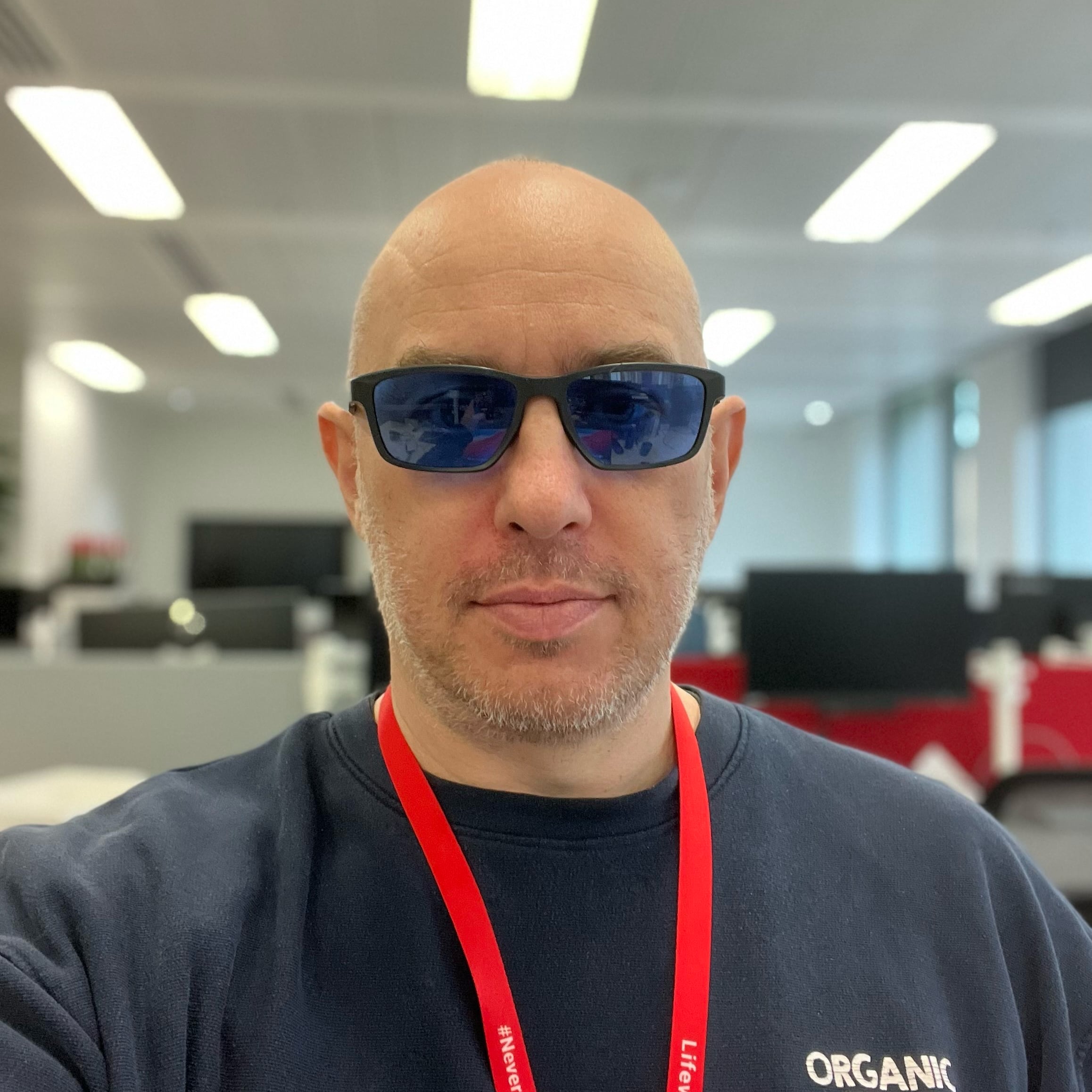
I now have two pairs of glasses — they’re tinted to help with my Scotopic Sensitivity Syndrome and they’re my creative lenses for reading. I ordered my first two pairs of blue lenses and have never looked back.
People often ask about them. Some assume they’re blue-light blockers; others think they’re sunglasses. I don’t mind explaining, though I do quietly wish more people knew about Irlen Syndrome.
They’ve become a conversation starter — a bridge to discuss accessibility in everyday terms.
How this changed my approach to accessibility
Before the diagnosis, I cared about accessibility as a professional ideal. Afterward, it became personal.
My early inspiration came from Jeffrey Zeldman’s Designing with Web Standards — the idea that accessible design isn’t just compliance, but craft.
Now, I see accessibility through a more embodied lens (literally).
For instance:
- I design for lighting variability, not just screen contrast.
- I advocate for testing beyond dyslexia, including Irlen/SSS and other visual processing differences.
- I’m aware that high contrast isn’t always good contrast — for some, too much starkness can trigger symptoms.
As a result, I now review content for:
- Text zoom compatibility
- Moderate contrast ratios (still AA-compliant but not harsh)
- Line spacing and length
- Options for tinted backgrounds or dark modes that respect visual stress sensitivities
Why awareness matters
The challenge is that Irlen Syndrome isn’t widely recognised in most education or workplace settings.
Children are often tested for dyslexia — but not for visual stress or Scotopic Sensitivity. Estimates vary, but studies suggest a meaningful minority — sometimes quoted around 15% — may experience some form of visual processing difficulty.
That’s a lot of people silently struggling to read slides, emails, or reports.
If schools included Irlen screening alongside literacy testing, many children might avoid years of frustration or self-doubt.
The same applies at work: providing better lighting options, tinted overlays, or flexible digital interfaces can make a world of difference.
The environment matters as much as the screen
Lighting — natural or artificial — changes everything.
Fluorescent lights, glare on a glossy desk, or even overly bright monitors can all trigger visual stress.
Now, when setting up a workspace or designing an interface, I think in terms of visual comfort zones, not just contrast ratios. That includes:
- Adjustable ambient lighting rather than stark overheads.
- Matte surfaces or anti-glare coatings.
- Option to customise colour themes (light blue backgrounds or low-contrast dark modes).
It’s not about special treatment — it’s about equitable access to information for every kind of visual brain.
A small lens, a big shift
It still surprises me how something so simple — a tint of colour — can have such an impact.
For years, I thought my reading challenges were about effort or attention. But Irlen Syndrome reframed that: it wasn’t about trying harder, it was about seeing differently.
Now, when I talk about accessibility with clients or students, I remind them that inclusion isn’t abstract. Sometimes, it’s as tangible as a blue lens, or as small as letting users choose the background colour that helps them read in peace.
Action checklist: supporting visual processing differences
- Learn about Irlen Syndrome / Scotopic Sensitivity and related visual stress conditions.
- Check your digital contrast settings — ensure AA minimums but avoid harsh extremes.
- Offer options: background colour themes, text resizing, and dark/light modes.
- Design for comfort: reduce glare, avoid all-caps blocks, and provide generous line spacing.
- Ask users or team members what visual adjustments help them focus.
- Promote awareness in schools and workplaces — Irlen testing is fast and non-invasive.
- Test interfaces with overlays or tinted filters to simulate different visual sensitivities.
- Encourage empathy: what looks fine to one person may flicker or distort for another.
Closing thoughts
Accessibility isn’t about perfection — it’s about possibility.
My blue lenses are both a tool and a reminder that small adaptations can unlock huge potential.
If you’ve ever felt exhausted by reading or working under bright lights, or if words seem to shift on the page, it’s worth exploring Irlen testing.
And if you design or manage digital products, remember: accessibility for visual processing disorders isn’t niche. It’s part of the human spectrum.
Featured work
ion Design System
Global design system for RS Group
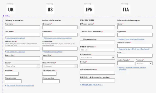
- Design System
- E-commerce
- B2B
Created a scalable, accessible design system adopted across RS Group’s global digital teams, aligning Figma and Tailwind through design tokens.
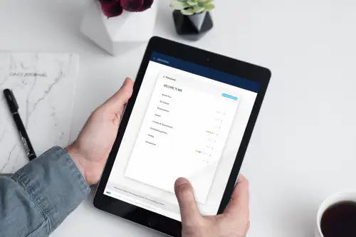
Client Onboarding
KYC onboarding for wealth management — faster, clearer, fewer errors
- SaaS
- Fintech
- Onboarding
- KYC
Co-created a configurable, advisor-led onboarding flow that reduced friction for investors and managers, and achieved 100% pre‑launch adoption with pilot customers.