Accessible Colour Tools I Actually Use
Building accessible colour systems takes a village — or in this case, a handful of trusty tools. Over time, I’ve built a small set I keep coming back to when exploring and testing colour schemes, building ramps, checking contrast, and defining design tokens. Some of these tools help me see what’s working, others help me find fixes quickly. None of them do everything, but together they make colour work more practical — and more fun.
Contrast Grid
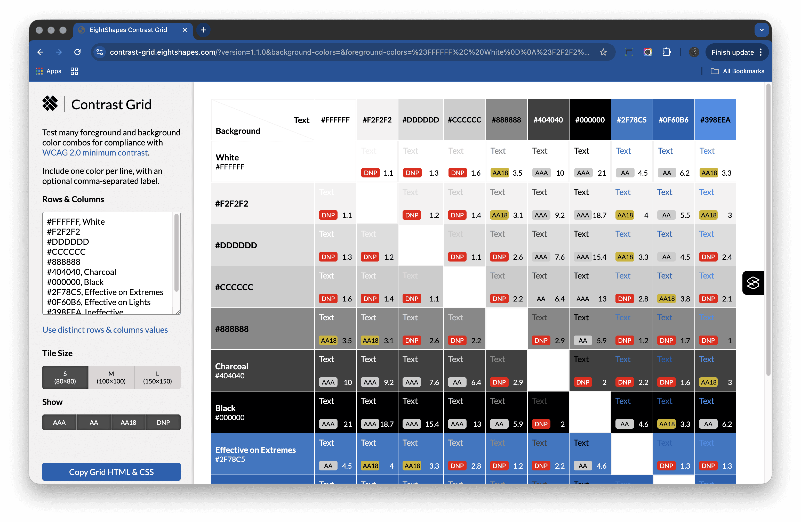
https://contrast-grid.eightshapes.com/
Contrast Grid is my go-to when I want the big picture. It lets you cross‑check multiple foreground and background colours at once, so you can see what passes, what fails, and what needs adjusting.
I use it for testing ramps, pairing colours for contrast, and keeping an overview of my design tokens. It’s quick, visual, and surprisingly flexible. I usually keep two text files ready — one with all my ramps and colours, and another with semantic design tokens — so I can paste them in whenever I want to check combinations.
This is the tool I use most. It’s my keystone reference point; I reach for the others when I need to zoom in on a specific task.
Coolors
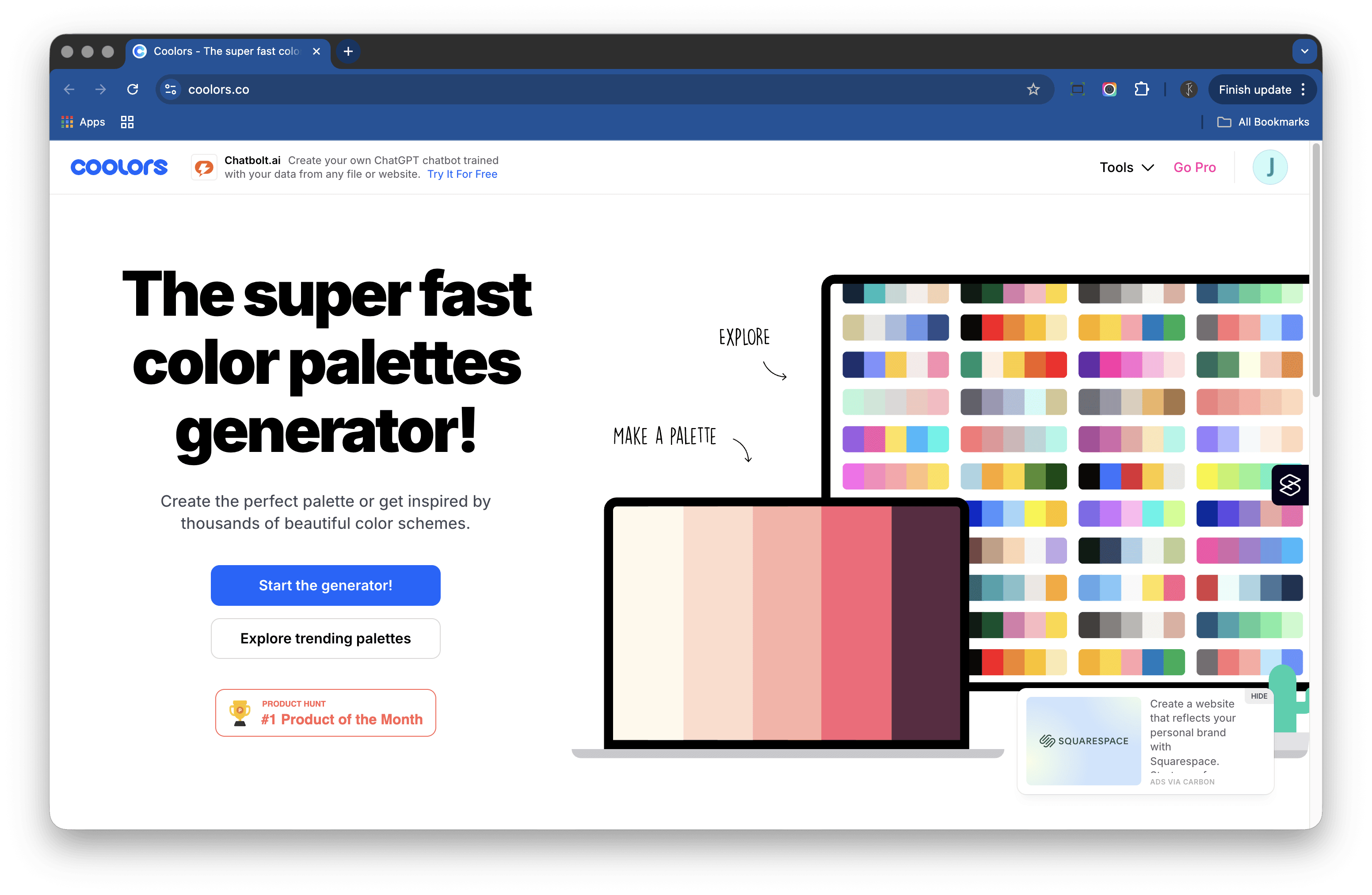
Coolors is one of those tools that does a lot — in a good way. There’s a palette gallery, a generator, ramp views, examples, and more.
I mainly use the palette generator when I’m stuck or need another option. I’ll lock the colours I like, hit the space bar, and see what comes up. Sometimes the random combinations spark new ideas. You can enter your own hex codes and switch to the gradient/ramp view, which helps me visualise how those colours might scale across a system.
The examples section is useful for a quick sense check of balance and contrast. It’s not an accessibility checker per se, though Coolors does have a basic contrast checker (handy but limited). I use Coolors to find promising palettes, then move to dedicated contrast tools to verify them.
Accessible Colors
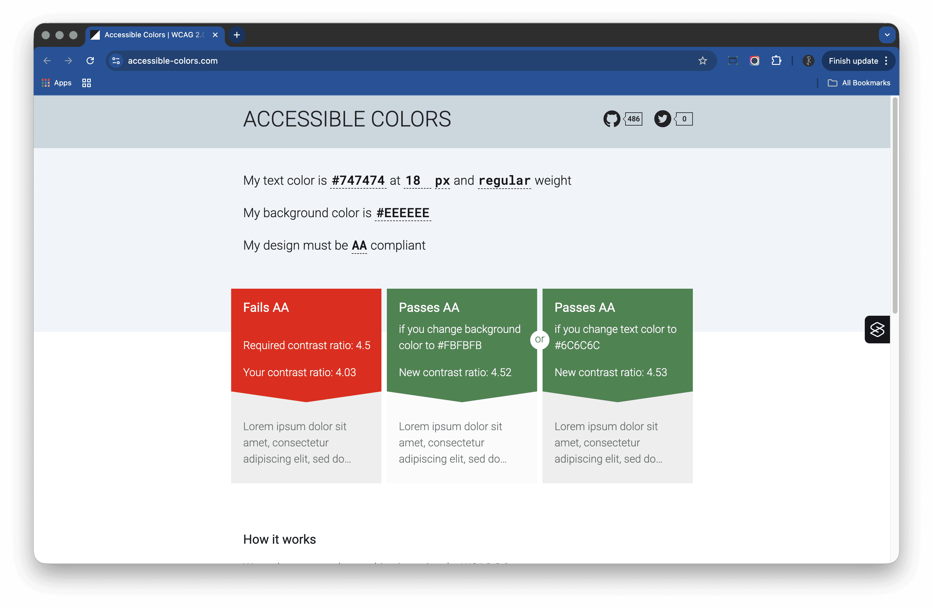
https://accessible-colors.com/
Simple and clean. You drop in a colour pair and it checks against WCAG 2.x; you can set the compliance level and, importantly, the text size and weight.
If a pair fails it suggests the nearest passing colours for both foreground and background, so you choose which part of the pair to adjust.
It’s brilliant for small tweaks when you want to meet colour contrast ratio (CCR) without losing the overall hue. I use it when a brand colour just misses passing, or when I’m nudging a button state to comply without breaking consistency.
Honourable mentions for colour contrast checking
- WEBAIM: Contrast Checker — You really can’t go wrong here.
- Alex Clapperton: Colour contrast checker — Great for visualising the colour pair; there’s also a Chrome extension.
- Accessible Web: WCAG Color Contrast Checker — Clear tables for AA and AAA showing small text, large text, and graphics.
- Coolors: Colour contrast checker — They really do have everything.
A different approach to colour contrast: APCA
The key difference between colour contrast ratio (CCR) and APCA (Advanced Perceptual Contrast Algorithm) is how they approach readability. CCR, defined by WCAG 2.x, measures the luminance contrast between two colours — a mathematical ratio. APCA, used in WCAG 3 drafts, models human perception, considering how we actually perceive brightness and contrast depending on text size, weight, and background. In short, CCR is ratio‑based, while APCA is perception‑based.
APCA Contrast Calculator
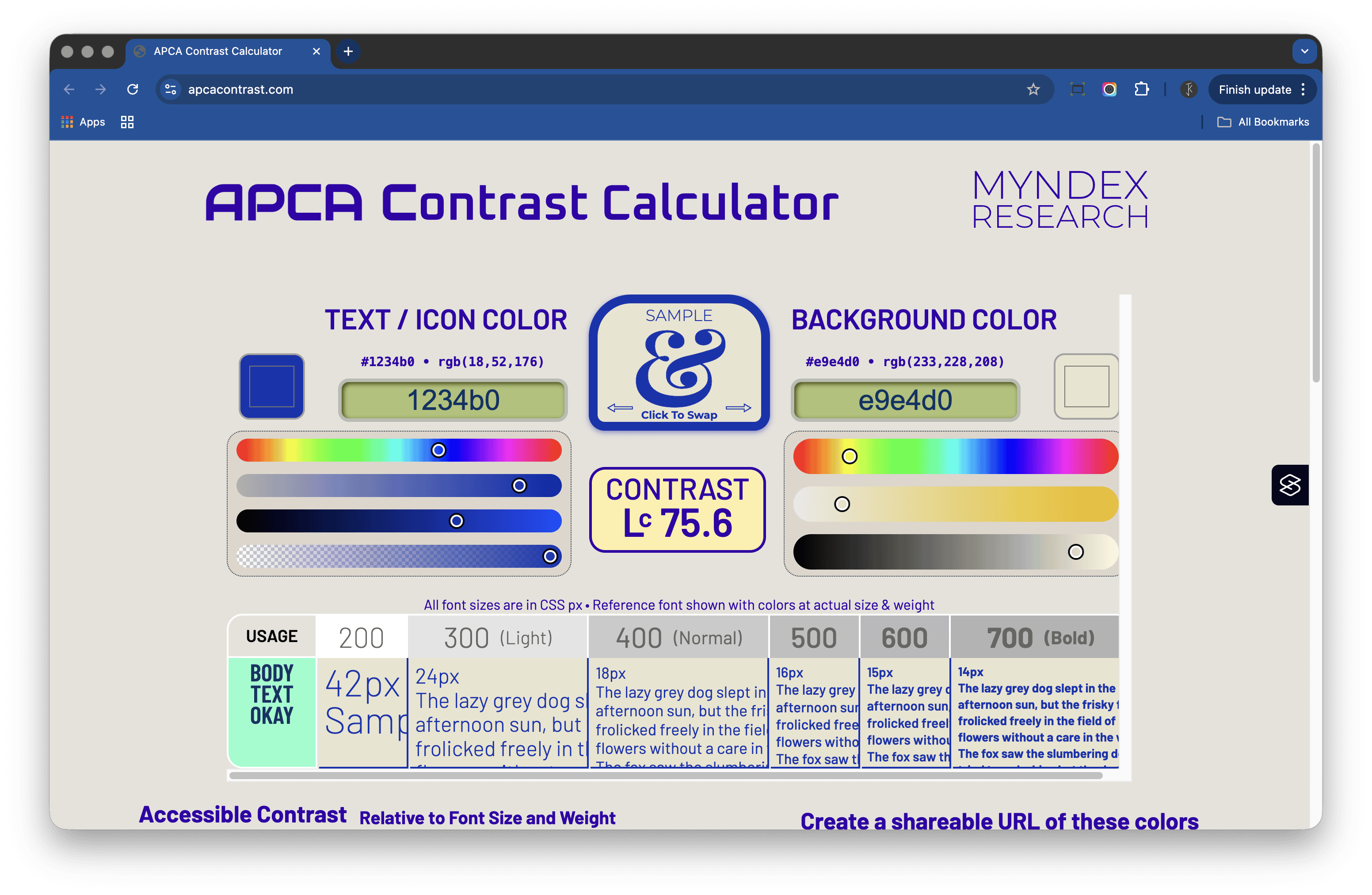
Mydex was the first tool I used that handles APCA — the newer contrast model that looks at perceptual brightness, not just numeric ratios. I use it to double‑check when a WCAG pass still looks a bit low‑contrast; it’s a good way to validate what my eyes are telling me. The checker also gives recommendations for font size and weight.
When testing with APCA, it helps to know what the ranges mean. For body text, an Lc (lightness contrast) around 60 is a practical target similar to AA body text; larger or bolder text can often pass near Lc 45. For critical UI elements or small text, aim for Lc 75+ to ensure strong legibility. APCA doesn’t map directly to AA/AAA — treat these as guardrails, not strict equivalents.
Accessible Palette Builder
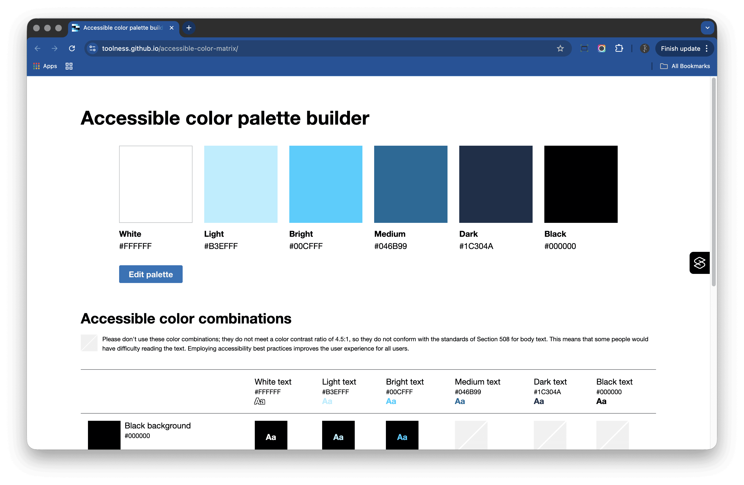
https://toolness.github.io/accessible-color-matrix/
Great for setting base design tokens — surface, text, and interaction colours.
It’s like a zoomed‑in version of Contrast Grid: fewer combinations, more control. I use it to define how colours interact, rather than testing every colour against every other one. It’s especially helpful when checking interaction states without the noise of a full matrix. If Contrast Grid helps me see the forest, this tool helps me fine‑tune the trees.
Silktide Toolbar
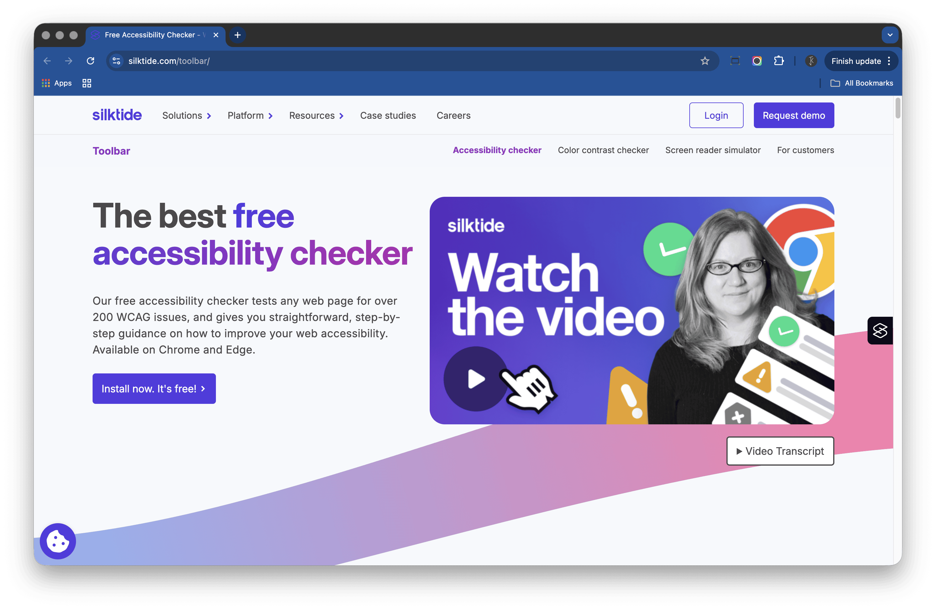
Silktide is more than a colour checker. It has tools that simulate visual differences, colour‑vision deficiencies, and impaired vision — essential for checking how your designs will work for different users.
It also enables a key reality check:
- Does your design work in greyscale?
- Can you tell interactive from non‑interactive elements at a glance?
Bonus tip: if you open your Figma design in the browser, you can run Silktide directly on your live layout. It’s a great way to see how a design might appear with different forms of visual perception. I use it when I want to step back and test how accessible something feels in the wild, not just on a swatch.
Stark
I don’t often check colour contrast directly inside Figma, but when I do, I use Stark. It’s a well‑designed plugin that lets you test as you go.
You can switch between WCAG 2.1 and APCA modes, which makes it handy when you want to compare results. It’s especially good for quick, in‑context checks before handing over to developers. Stark keeps accessibility in the flow, not as an afterthought.
Colour ramps and blenders
Ramps are where things get tricky. I’ve tried a lot of colour‑ramp generators and, honestly, none of them feel perfect yet.
Many assume your base colour sits at the midpoint (5/500), which only works if every hue has similar contrast against that base. In reality, brand colours often sit at very different points on the scale.
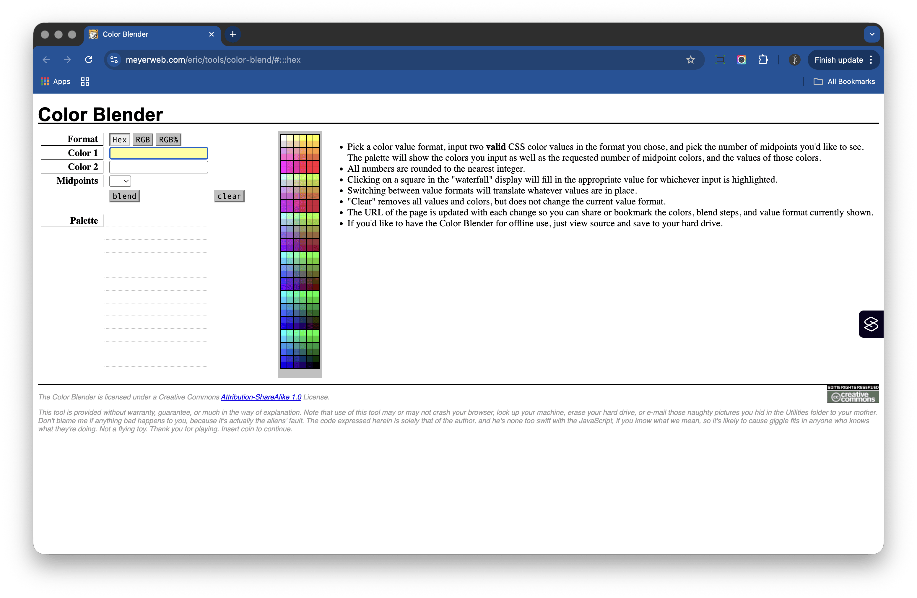
So, here’s what I do: I use stepped gradients or blenders — such as Eric Meyer’s Color Blender (https://meyerweb.com/eric/tools/color-blend/#:::hex) — to build my own ramps. Usually, I start with ten or twelve steps. My quick process:
- Set the base colour and blend against white, off‑white, or the lightest surface colour.
- Repeat, blending against black, near‑black, or the darkest tone in the palette.
- Select about every other step, ignoring the first and last.
- Test and tweak by eye, then adjust to hit your contrast targets.
After this I usually end up with a smooth, ten‑point ramp that feels balanced across both light and dark surfaces. It takes a little more time, but the control and visual harmony are worth it.
Premade colour systems
- Tailwind Colors (https://tailwindcss.com/docs/colors)
- Open Color (https://yeun.github.io/open-color/)
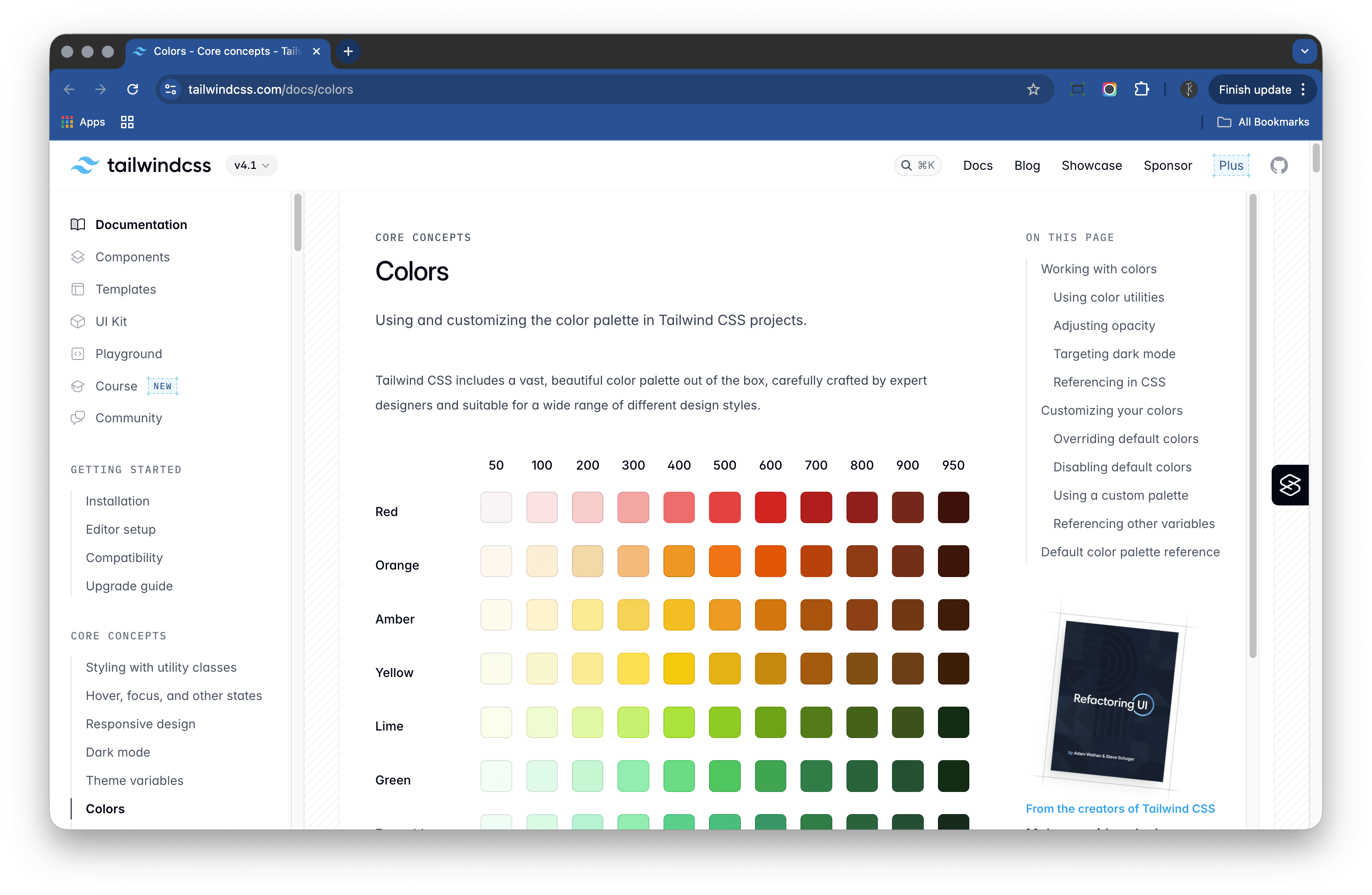
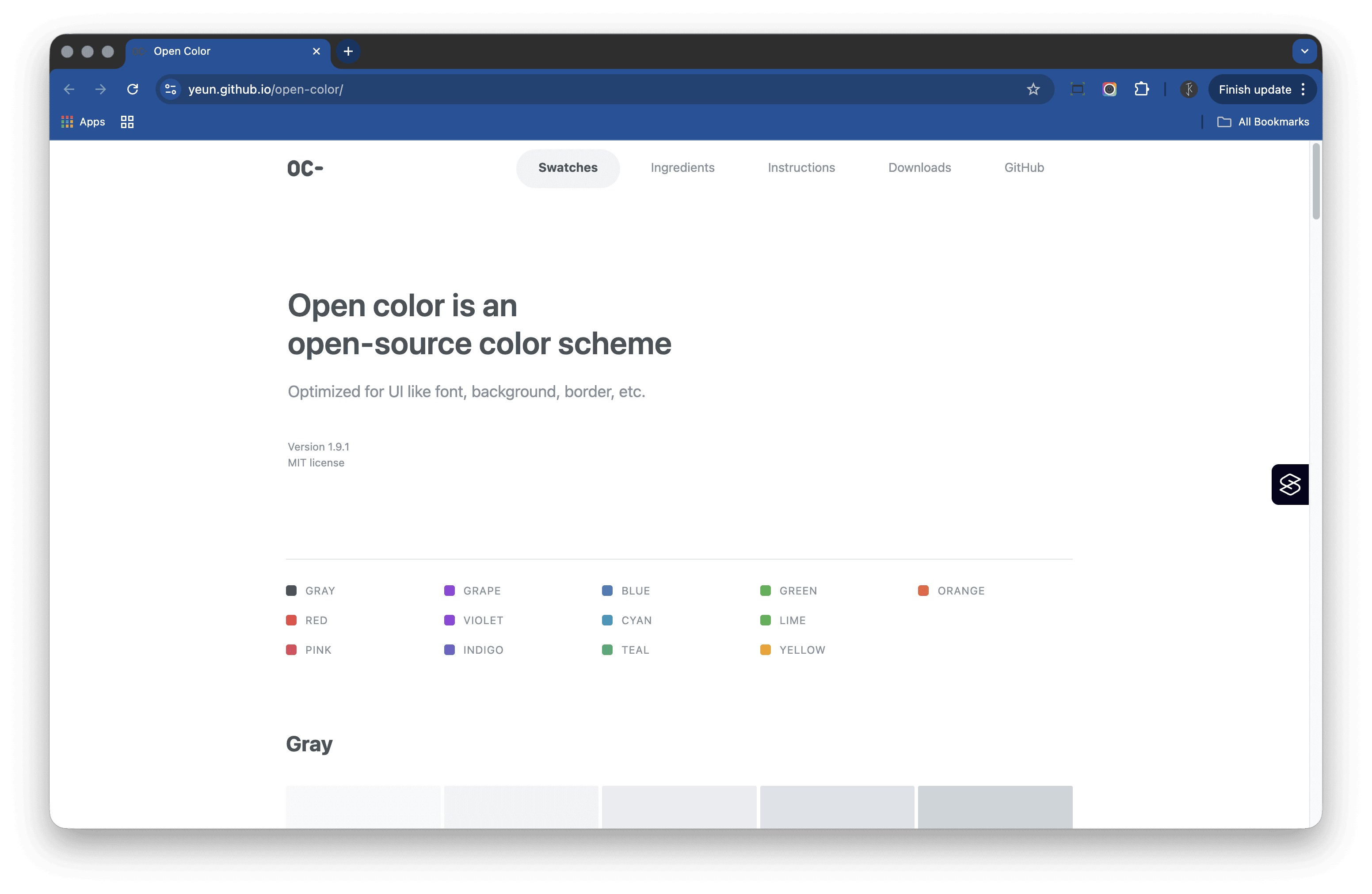
Sometimes you just need to start somewhere. Tailwind Colors and Open Color are great prebuilt systems when the brand palette isn’t locked yet, or you need to make progress quickly.
They give you a consistent structure of ramps you can adapt later. I use them as placeholders or to fill gaps in early‑stage systems, then replace or tweak as the colour system evolves and the branding is finalised.
Tip: Don’t let the search for perfection slow you down — these libraries are a solid base to work from.
Building accessible colour systems is rarely a one‑tool job. Each of these has its strengths, and together they help balance precision with creativity.
For me, accessibility isn’t about checking boxes — it’s about making sure design feels clear, legible, and inclusive from the start. With the right mix of tools, the “village” makes colour work clearer and kinder for everyone.
Featured work
ion Design System
Global design system for RS Group
- Design System
- E-commerce
- B2B
Created a scalable, accessible design system adopted across RS Group’s global digital teams, aligning Figma and Tailwind through design tokens.
Client Onboarding
KYC onboarding for wealth management — faster, clearer, fewer errors
- SaaS
- Fintech
- Onboarding
- KYC
Co-created a configurable, advisor-led onboarding flow that reduced friction for investors and managers, and achieved 100% pre‑launch adoption with pilot customers.