Design tokens and colour systems that scale
Design tokens turn colour decisions into reusable, testable data. Start with surfaces and text, layer in interactions and semantics, then respect brand. Name tokens by use, not hue. Meet WCAG contrast (4.5:1 for regular text, 3:1 for large text and UI components), and never rely on colour alone. Ship a small, durable set first, then evolve.
Good colour systems do three jobs: they make interfaces legible, guide attention, and travel across brands and themes without rework. Design tokens encode those decisions so designers and engineers make the same choice by default, everywhere.
What are design tokens?
Design tokens are named pieces of UI decision data (e.g., colours, typography, spacing) that tools and code can share consistently. The Design Tokens Community Group maintains a common exchange format used across many tools.
The five token categories
Surfaces (backgrounds) and borders


Start with three surfaces: page, surface, and surface-alt. Use them to build your contrast pairs. Define border and border-muted with at least 3:1 contrast against adjacent surfaces to satisfy non-text contrast for UI components.
Rule of thumb
- Regular text: ≥4.5:1 contrast.
- Large text (≥24 px, or ≥19 px bold): ≥3:1 contrast.
- UI components and graphical objects (e.g., borders, icons): ≥3:1 contrast.
Text


Provide four text tokens that work across all surfaces:
- text/normal: default foreground.
- text/muted: secondary copy, lists, meta.
- text/strong: emphasis or dense UI.
- text/reverse: used when surfaces invert (e.g., dark mode chips).
Interactions


Define states for links and buttons that are visibly distinct:
- default: the normal appearance.
- hover: visible when a user’s pointer is over the element.
- active (or pressed): shown while the element is being clicked or tapped.
- disabled: indicates the element cannot be interacted with.
- visited (links): differentiates previously opened links.
Keep one primary CTA for clarity. Ensure each state meets the contrast rules above.
Semantics and Feedback


Map feedback and statuses to meaning, not hue names:
- positive (success)
- negative (error/destructive)
- warning (caution)
- info (neutral status)
Never rely on colour alone. Add an icon, label, or pattern so users with colour-vision deficiencies still get the message.
Tip: If your brand’s red is close to the error red, adjust the semantic ramp or pick a distinct, accessible hue/value pair.
Brand
Treat brand as a consumer of the system. Often brand colours arrive as Pantone or print values. Adjust the digital values slightly to pass contrast; note the change and rationale in the changelog.
Naming tokens that humans and tools understand
Name tokens by purpose and context, not by hex or hue—error/background beats red-50. A simple, BEM-like pattern works well:
[block]/[element]/[state]
Examples:
alert/background/positivealert/border/positivetext/muted/default
When you store tokens, use the Design Tokens Community Group (DTCG) JSON properties ($value, $type, $description) for broad tool support. Avoid special characters that the spec disallows in names.
Worked example: a semantic alert across modes
Component anatomy
Container background, 1 px border, leading icon, text.
Tokens
alert/background/positive→green/50alert/border/positive→green/300alert/text/positive→green/700text/normal,text/muted,text/reverseas globals
Light mode
- Background (
green/50) vs text (green/700) ≥ 4.5:1. - Border (
green/300) vs background (green/50) ≥ 3:1.
Dark mode
Swap to darker surfaces and invert text using text/reverse. Re-check contrast: text ≥ 4.5:1; border vs surrounding ≥ 3:1.
Do not rely on colour only.
Use three points of failure: colour, icon, and then the content itself (text. Include a “tick” icon and the word Success in the message.
Colour modes and multi-brand
Start with light and dark modes, then add high contrast and low-glare if needed. For multi-brand, keep surfaces and text shared wherever possible, and allow brand and semantics to vary by theme. Test destructive red against brand reds to avoid ambiguity.
Building ramps and contrast pairs
Use a small, ordered ramp for each hue (e.g., 50–900). Pick pairs that meet the contrast rules and feel consistent. Automated contrast checkers are useful, but always test in context and at real sizes.
Decision table: which contrast threshold?
| Element | Minimum contrast | Why use it |
|---|---|---|
| Body text (regular) | 4.5:1 | WCAG 2.2 AA text |
| Large text (≥24 px or ≥19 px bold) | 3:1 | WCAG 2.2 AA large text |
| UI components & borders | 3:1 | Non-text contrast |
Common pitfalls and how to avoid them
- Colour-only semantics: add icons and labels.
- Brand clashes: adjust semantic ramps.
- Hue-based names: prefer purpose-based names.
- Pantone-to-hex drop-ins: test and tweak for screen contrast.
Design tokens turn colour decisions into reusable, testable data. Start with surfaces and text, layer in interactions and semantics, then respect brand. Name tokens by use, not hue. Meet WCAG contrast (4.5:1 for regular text, 3:1 for large text and UI components), and never rely on colour alone. Ship a small, durable set first, then evolve.
Key Take Away
Design tokens give teams a shared language for colour decisions. Keep names purpose-driven, meet contrast by default, and design semantics that are unambiguous across brands and modes. Start small, ship, then refine.
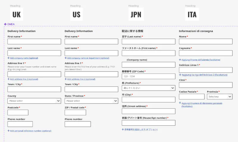
Colour examples in this article are taken directly from the Ion Design System palette for demonstration purposes.
Featured work
ion Design System
Global design system for RS Group
- Design System
- E-commerce
- B2B
Created a scalable, accessible design system adopted across RS Group’s global digital teams, aligning Figma and Tailwind through design tokens.