Aurum Design System Scalable, White-Labelled SaaS Design System
Overview
Problem
Contemi was transitioning legacy desktop software into a cloud-based SaaS platform. The product needed a unified, modern, and timeless look that could be white-labelled across multiple clients, while ensuring scalability and maintainability for future products.
Goal
Create a flexible design system and visual identity that worked across the Contemi group, supported co-branding, and empowered developers and designers to deliver consistent, accessible interfaces at speed.
Challenges
- Delivering 12 distinct product modules across 7 squads in under 18 months, while maintaining quality and consistency.
- Supporting white-labelling without compromising usability or brand cohesion.
- Being the sole designer for most of the project, requiring highly efficient workflows and clear documentation.
- Driving developer and product owner adoption across distributed teams in multiple time zones.
- Balancing brand guidelines with client-specific theming needs.
Role Lead UX Designer
Responsible for end-to-end UX and visual design, including research synthesis, journey mapping, wireframes, prototypes, high-fidelity design, and supporting developer implementation.
Team
7 product squads (2–3 developers and 1 product owner per squad), supported by product owners, business analysts, SME stakeholders, front-end and back-end engineers, QA specialists, and additional designers where required.
Responsibilities
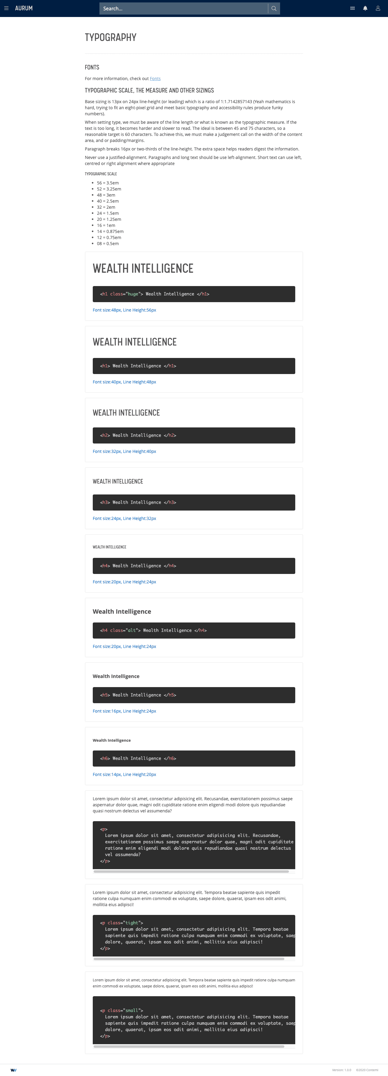
- Defined typography, colour palettes, iconography, and layout grid.
- Designed and documented UI components, patterns, and visual rules.
- Collaborated with engineering to create a front-end framework and interactive design system manager (DSM).
- Extended brand identity, including refinement of the WIN logo.
Approach
Foundation & Identity – Selected typography, established 8-pixel grid, chose icon sets, and created rules for components.
Icon System (Reduplication) – Developed a modular icon language using a 2×2 grid, simple geometric shapes, and opacity variations to form a consistent, adaptable visual signature.


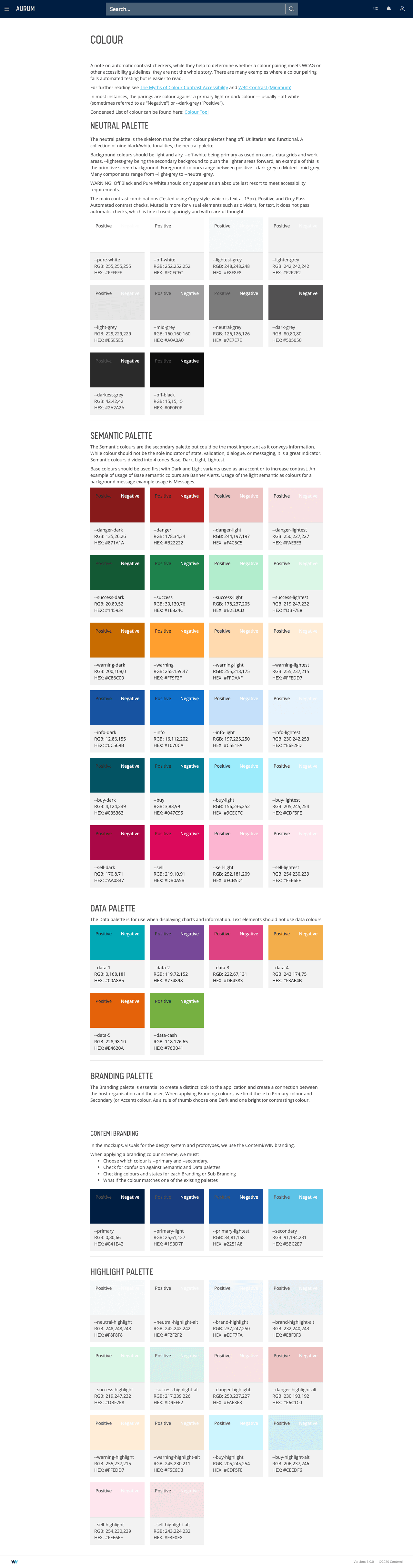
- Colour Architecture — Designed a structured palette system:
- Neutral palette for base structure and depth.
- Semantic palette for intent (danger, success, warning, info, buy, sell).
- Data palette for charts.
- Client branding palette (primary + secondary colours) for white-labelling.
White Labelling Strategy – Developed a scalable theming approach that applied client-specific primary and secondary colours across all modules without requiring code rewrites, ensuring brand alignment while retaining usability.
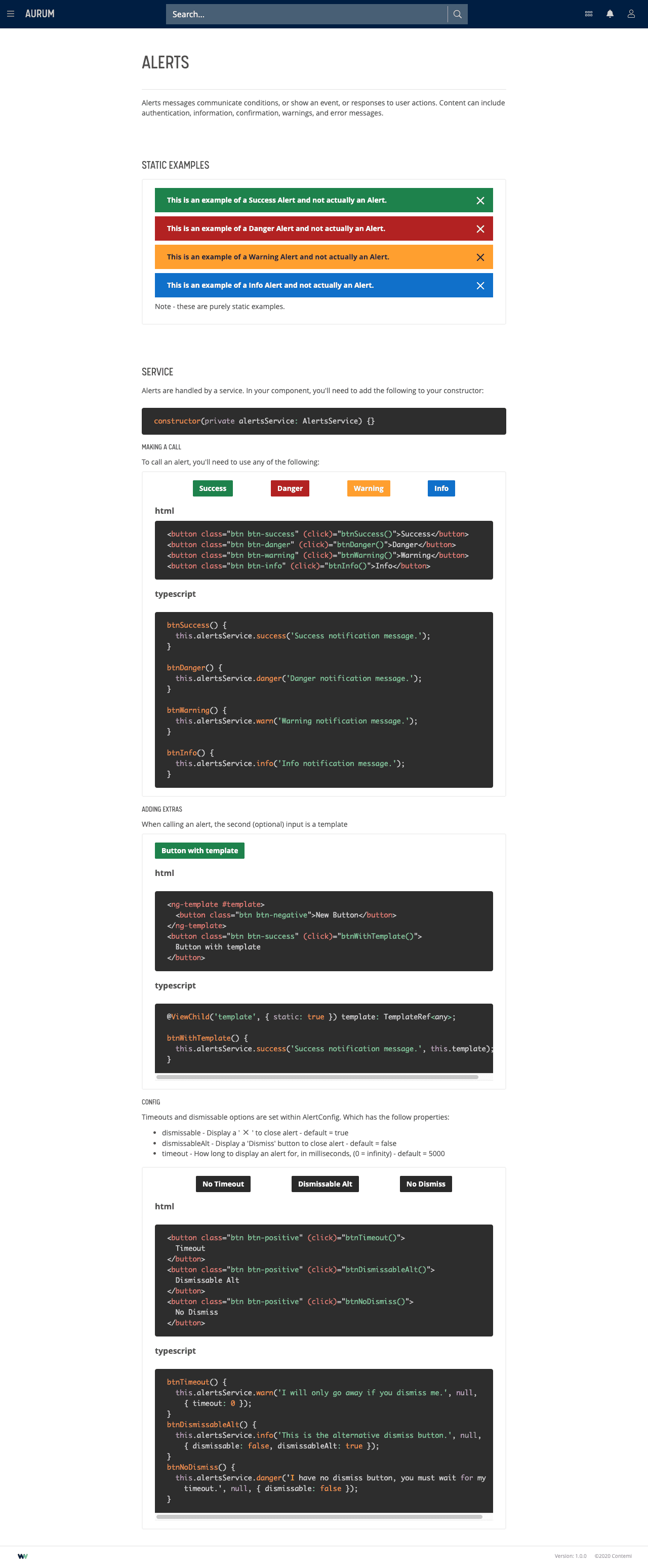
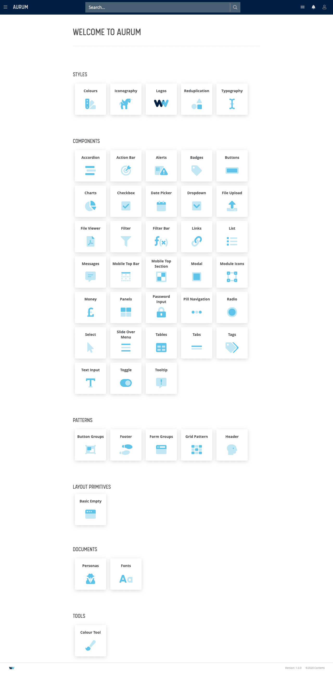
Component & Pattern Library – Defined styles, components, layout primitives, and interaction patterns, creating reusable building blocks for rapid delivery.
Solution
A modular, white-label-ready design system that:
- Applied consistent branding while supporting client theming.
- Used semantic design tokens for flexible, scalable UI updates.
- Enabled rapid module development via a shared code library.
- Provided a single source of truth for design and development.
Impact & Results
- 12+ modules
- 7 squads
- 100% adoption
Quantitative Outcomes
- Delivered 12+ product modules across 7 squads in under 18 months
- Significantly reduced design-to-development cycles with a shared code library
- Achieved 100% adoption across squads, strengthening brand consistency
Qualitative Outcomes
- Strong positive reception from developers, product owners, and sales teams
- Reinforced Contemi’s brand consistency across products and clients
- Contributed to industry recognition, including awards at WealthBriefing and Systems in the City