ion Design System Global design system for RS Group
Overview
Problem
RS Group’s previous design system, Prometheus, lacked scalability, accessibility, and adoption. Teams across regions were using inconsistent patterns, leading to inefficiency, poor usability, and high maintenance costs.
Goal
Build a modern, token-driven design system (ion) that aligned with the RS rebrand, worked across React and Vue teams globally, and was accessible by default.
Challenges
- Rebranding and redesign at FTSE 100 scale, with EMEA & APAC rollouts.
- Ensuring accessibility (WCAG/EAA) and semantic consistency across 70+ components.
- Driving adoption across busy product teams with competing priorities.
- Aligning Figma, Tailwind, and engineering tokens into one shared language.
- Delivering adoption through workshops, presentations, and governance.
Role UX Design Manager
Responsible for strategy, adoption, and delivery. Hands-on in early phases with colour systems, design tokens, and accessibility standards. team: Product Designers, Researchers, Engineering Leads, Dedicated Design System Engineers.
Team
Product Designers, Researchers, Engineering Leads, Dedicated Design System Engineers.
Responsibilities
- Defined semantic colour system and WCAG-compliant palettes.
- Created design tokens aligned to Tailwind and Figma variables.
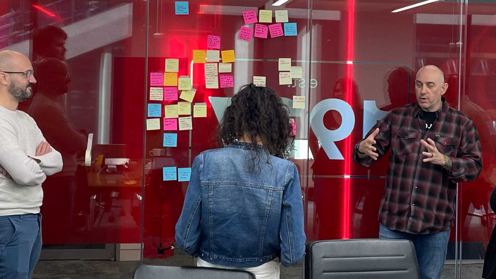
- Ran workshops with designers, engineers, and product teams for alignment.
- Directed the migration from Prometheus to ion, ensuring consistency across 70+ components.
- Championed adoption through internal presentations, comms, and update processes.
Approach
- Design Tokens & Colour System – Collaborated with engineering to define tokens and a semantic colour system, ensuring accessibility and brand alignment.
- Workshops & Training – Ran adoption sessions with product teams, engineers, and designers to embed ion in daily workflows.

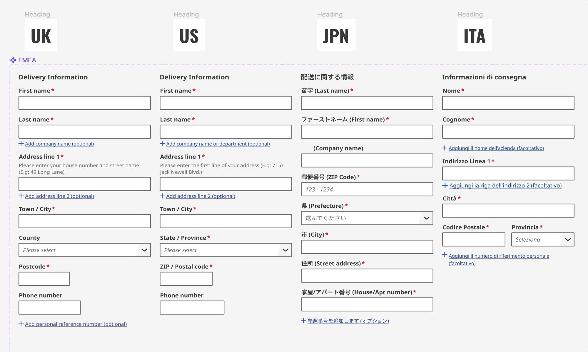
- Cross-Platform Consistency – Aligned React and Vue component libraries across regions, using tokens as the shared source of truth.

- Figma Integration – Standardised all UX teams globally on Figma with ion as the single source of truth.
- Governance & Communication – Established channels, update emails, and feedback loops to maintain adoption and trust.

Solution
A global design system with:
- 70+ components and 90+ icons.
- Semantic design tokens shared between Figma and Tailwind.
- Accessibility standards built-in by default.
- Adoption across EMEA & APAC product teams.
Impact & Results
- 70+ components
- 40% faster design time
- Global adoption
Quantitative Outcomes
- Delivered 70+ components and 96 icons, replacing the legacy Prometheus system (32 components)
- Time-and-motion study showed a 40% reduction in design time when using Ion compared with previous assets
- SUS score range: 85 to 96.7 (a pass score is 68 out of 100)
- Adopted across EMEA, APAC, and Americas sites with consistent rollout of header, footer, and new brand components
Qualitative Outcomes
- Positive feedback from researchers — fewer usability issues in testing
- Integrated into RS Group’s business strategy and BAU processes
- Strengthened collaboration between design and engineering through tokens and shared language